

4.1
What is a design system?
Knowledge store and toolbox
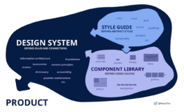
Design systems are knowledge stores and toolboxes at the same time to design consistent and intuitive user interfaces. They link a variety of topics, such as style guideline, component library or information architecture and accessibility. Design systems establish certain rules and dependencies for the design of brands and - as in our case - digital applications. To do this, these systems divide the design into its individual parts, such as typography and color, and use them to define repeating patterns, such as a contact form.
Handling change
Digital applications in particular are subject to constantly changing requirements: Sometimes the content becomes more extensive, sometimes the brand design changes, sometimes a new end device comes into focus or a new target group is addressed. This volatility can be managed with robust design systems, because at best they enable consistent design across all screen sizes and use cases. A lot of modern companies now work with such systems because they understand that their brand and their (digital) applications are a living ecosystem that is also constantly evolving and adapting.
Collaborative foundation
A design system forms the foundation, a common language, for the collaboration of designers, programmers, project managers and customers, among others. Building a design system helps to better understand what is being designed as the design is broken down into its component parts. In this way, the individual parts as well as the whole can be analysed, evaluated and further developed. This makes it easier for designers and editors to set up new applications and makes the content units and hierarchies quickly recognizable for their users.
Popular design systems
4.2
How to build a design system
Component library
Good wireframing usually shows the necessary design elements with which the various screens or pages are built. Such elements are, for example, different types of text such as headlines or body text, but also buttons, navigation, slide shows and lists. The most well-known method to organize these elements is the so-called Atomic Design - originally developed by Brad Frost.
Atomic Design
Derived from chemistry, this method breaks down design from the smallest unit that cannot be further simplified, such as the choice of font (atom), to the most complex combination, such as the template of a website (species).
1. Atoms
Cannot be broken down further.
Border
Breakpoints
Color
Grids
Motion
Opacity
Shadows
Spacing
Typography
…
2. Molecules
Can be broken down into Atoms.
Inputs
Form labels
Error text
Dividers
Lists
Icons
Badges
Tooltips
…
3. Cells
Made up of two or more molecules.
Form fields
Alerts
Product tiles
Menus
Time / date pickers
User comments
Breadcrumbs
…
4. Organisms
Distinct sections of pages or screens that are made up of atoms, and/or molecules, and/or cells.
Forms
Carousels
Banners / Snackbars
Header
Footer
Upload modal
…
5. Species
Templates of complete pages or screens, whereas the pages built using the library are built in another file.
Landing pages
Product listing page
Product detail page
Article page
Event page
…
UI Kit
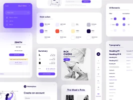
To set up a digital design system, you’re constantly building a visual library in your design software (Figma, XD, Sketch, ...) that maps and unifies all the essential design elements. Especially in larger and collaborative design projects, it is helpful to have a central file containing the latest designs from which all team members can quickly build new designs and prototypes.
Tools
4.3
Perspectives on user interfaces
Functionality
Functionality has top priority when designing user interfaces. Even complex operations can be easy for the user to perform with an intuitive interface. If a digital application is not user-centric or human-centered and difficult to use, it probably will not prevail. In particular, people with cognitive or sensory disabilities must be included in the design of the digital world. There are certain norms and standards for this, such as the Web Content Accessibility Guidelines (WCAG 2.0).
Experience
But less measurable factors also have a major impact on how a digital application is perceived. Is the operation smooth and fun? Microanimations and comprehensible page transitions can help here. Does the application work in your possibly existing brand cosmos? Is the experience on-brand? There is a whole book on this, ›Branded Interactions‹ by Katja Wenger and Marco Spies.
Wellbeing
A rather new criterion of user interfaces is the impact on the (mental) well-being of the users. The more screen time we have into our everyday life, the more user interfaces determine our environment and thus even our biorhythm. In response, many operating systems now have a night mode with a blue light filter. There are also attempts to adapt interfaces more to natural conditions, for example by simulating natural light and color behavior at certain times of the day.
Common user interface styles

4.1
What is a design system?
Knowledge store and toolbox
Design systems are knowledge stores and toolboxes at the same time to design consistent and intuitive user interfaces. They link a variety of topics, such as style guideline, component library or information architecture and accessibility. Design systems establish certain rules and dependencies for the design of brands and - as in our case - digital applications. To do this, these systems divide the design into its individual parts, such as typography and color, and use them to define repeating patterns, such as a contact form.
Handling change
4.2
How to build a design system
Component library
Good wireframing usually shows the necessary design elements with which the various screens or pages are built. Such elements are, for example, different types of text such as headlines or body text, but also buttons, navigation, slide shows and lists. The most well-known method to organize these elements is the so-called Atomic Design - originally developed by Brad Frost.
Atomic Design
UI Kit
To set up a digital design system, you’re constantly building a visual library in your design software (Figma, XD, Sketch, ...) that maps and unifies all the essential design elements. Especially in larger and collaborative design projects, it is helpful to have a central file containing the latest designs from which all team members can quickly build new designs and prototypes.
4.3
Perspectives on user interfaces
Experience
Functionality has top priority when designing user interfaces. Even complex operations can be easy for the user to perform with an intuitive interface. If a digital application is not user-centric or human-centered and difficult to use, it probably will not prevail. In particular, people with cognitive or sensory disabilities must be included in the design of the digital world. There are certain norms and standards for this, such as the Web Content Accessibility Guidelines (WCAG 2.0).
Functionality
But less measurable factors also have a major impact on how a digital application is perceived. Is the operation smooth and fun? Microanimations and comprehensible page transitions can help here. Does the application work in your possibly existing brand cosmos? Is the experience on-brand? There is a whole book on this, ›Branded Interactions‹ by Katja Wenger and Marco Spies.
Wellbeing
Popular design systems